Why you should ship your silly side projects
In December 2021, I took part in Netlify's Dusty Domains project, which encouraged developers to finally ship code to those unused domains they'd been saving for later. For each new site shipped, Netlify and friends donated $500 to a selection of charities, which resulted in a total of $100,000 donated to Code2040, Resilient Coders, STEMTank, and Black Girls Code. Great work, team!
I really had no idea how my contribution to Dusty Domains was going to turn out. But I knew I wanted to launch whitep4nth3r.live, and I knew I wanted keep things simple. As usual, I built this project live on Twitch — and it turned out to be a little bit silly. But silly websites and silly ideas are often some of the most creative vehicles for learning. And that's what I want to talk about in this post.
I remember vividly and fondly a time at primary school — 25 years ago — when we were learning about the effects of alcohol on our bodies. Instead of standing at the front of the class with a serious face — our teacher spent most of the lesson wobbling around the classroom, slurring his speech, and generally being silly — all whilst delivering the teaching material. I don't think I'll ever forget this lesson, and I always drew on this approach for inspiration when I was a classroom music teacher.
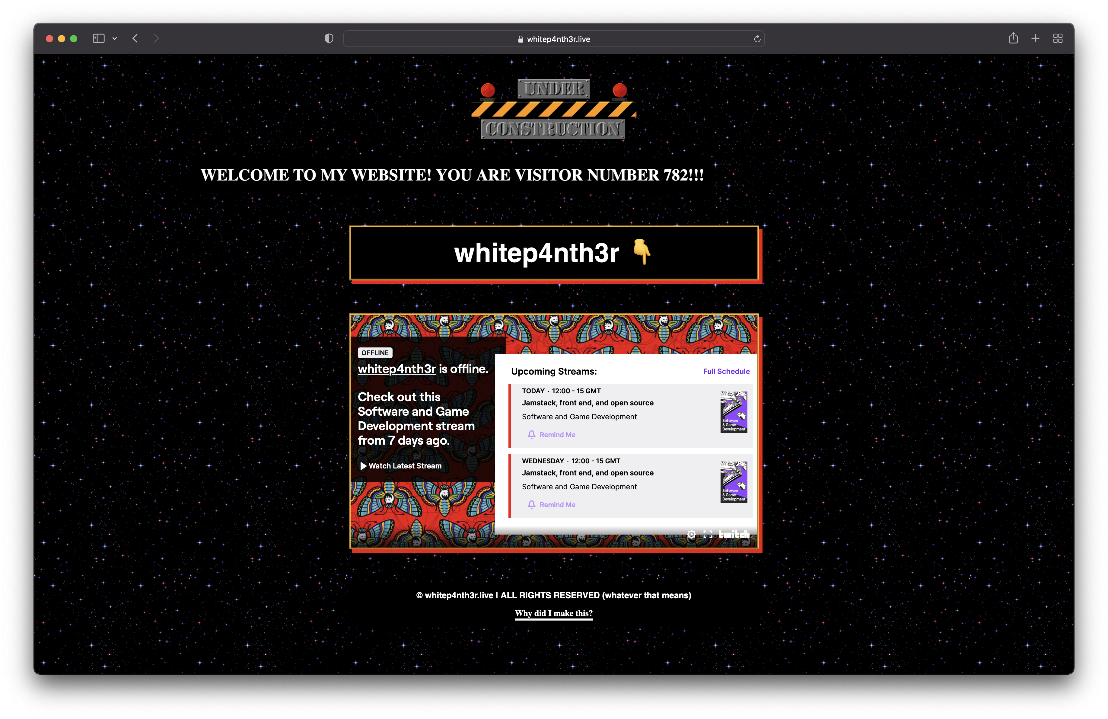
whitep4nth3r.live is a raw GeoCities throwback. It's ugly, it's kitsch, and it doesn't really offer much functionality, apart from watching my Twitch stream when I'm live. It includes a CSS-simulated scrolling marquee with a randomised visitor counter, a custom mouse pointer, custom scrollbars, and a tiled GIF background.

And the best part is — it scores all greens on Google Lighthouse, proving that even silly things can be built well for the web.

So what important things did we consider during the build that helped us nail these scores? Let's take a look at a few examples.
whitep4nth3r.live shipped with light and dark colour schemes. I'm not a fan of dark and light mode toggles on websites, but rather I prefer to implement dark and light modes based on system settings — that is the toggle! To respect user system settings, we can use the CSS media query prefers-color-scheme together with CSS variables (also called custom properties) to build light and dark theme palettes.
In style.css, I defined CSS variables (prefixed with --) for the colour theming in the document :root (read more about the root element on MDN) — a few colours, a border style, and a background image. I chose a dark theme as default, and adapted the CSS variables in the prefers-color-scheme: light media query for a light theme.
/* style.css */

:root {
  --color-bg: #000000;
  --color-fg: #ffffff;
  --color-bs: #ffb626;
  --color-sb: #f11012;

  --border-style: groove;
  --bg-tile: "./bg_stars.gif";
}

@media (prefers-color-scheme: light) {
  :root {
    --color-bg: #ffffff;
    --color-fg: #0f111a;
    --color-bs: #f11012;
    --color-sb: #ffb626;

    --border-style: solid;
    --bg-tile: "./bg_squiggle.gif";
  }
}
You might expect to see a larger palette of colours in a "more serious" project, but this isn't always the case. Take, for example, my colour theming for this website — whitep4nth3r.com — where in the prefers-color-scheme: light media query, I only need to change five colours to switch the theme!
@media (prefers-color-scheme: light) {
  :root {
    --color-bg: var(--white);
    --color-bg-lighter: var(--white);
    --color-fg: var(--black);
    --color-link: var(--color-fg);
    --color-highlight: var(--red);
  }
}
Read more about prefers-color-scheme on MDN.
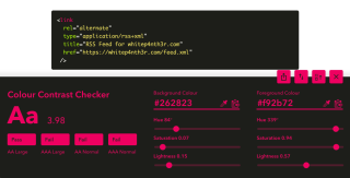
And of course, we had to make sure that both the dark and light themes passed colour contrast checks for accessibility. Check out this blog post — How to make your code blocks accessible on your website — if you'd like to find out more about how I check for accessibility and colour contrast.
In keeping with the throwback GeoCities theme, we built a fake scrolling marquee with CSS, using the following CSS keyframe animation.
@keyframes marquee {
  0% {
    -webkit-transform: translateX(100%);
    transform: translateX(100%);
  }
  100% {
    -webkit-transform: translateX(-100%);
    transform: translateX(-100%);
  }
}

.fakeMarquee {
  /* other styles */
  animation: marquee 60s infinite;
}
Animations and motion can be great — but some people may prefer to minimise the amount of non-essential motion that happens on a website. We can use the prefers-reduced-motion media query to detect this setting. Now, prefers-reduced-motion doesn't always mean no motion, but in the case of fake scrolling marquee, we chose to display it statically at the centre of the page when this setting is detected.
@media (prefers-reduced-motion) {
  .fakeMarkquee {
    /* other styles */
    animation: unset;
  }
}
Read more about prefers-reduced-motion on MDN.
whitep4nth3r.live is built with no frameworks — just good old HTML, CSS and JavaScript. Whilst frameworks can provide you with, well, a framework with which to build your projects— they're really not always necessary. I love building with no frameworks. It's liberating! And it helps you learn so much more about native browser APIs, empowering you to build even better when you finally do move on to using a framework.
I had used prefers-reduced-motion and prefers-color-scheme before building this project, but the simplicity of the implementation on whitep4nth3r.live coupled with the silly GeoCities-centric design really made these concepts stick for me — and the viewers in the live stream. And this is all at the heart of why I urge you all to build stuff, learn things and love what you do. If you're not loving it, you're not having fun. And if you're not having fun... what are you even doing? 🤪
Take a look at the source code on GitHub for whitep4nth3r.live for inspiration. And next time you've got an idea for a project that might be a bit silly — go ahead and build it. You never know what you might learn!

