How to load responsive images in AVIF and WebP using the HTML picture element
We released support for the new AVIF image format on the Contentful Images API at our Fast Forward 2021 conference. This means you can return your images stored in Contentful in the new AVIF format via the REST API with a query parameter, or via the GraphQL API with a transform function in your query.
But what is AVIF — and should you be using it right now?
Now this stuff is tricky, so strap in and get ready for a wild ride! In this post, we’ll cover:
Image formats, compression and browser support
Why image compression is important
The HTML
<picture>elementLazy loading and browser support
Performance improvements gained with AVIF
Are you ready? Let’s go.
In short, AVIF is the new kid on the block when it comes to image compression. Released in 2019 by the Alliance for Open Media, AVIF claims to offer 30% better compression than current alternatives such as WebP. It’s optimized for the web, designed with a low computation footprint, and what’s more — it’s open source.
Websites in 2021 are an incredibly visual experience, full of images, animations and full-page photography. If you’re not careful, you can end up forcing visitors to your website to download hundreds of megabytes of images on a visit to your page. This risks making your website slow, inevitably causing your visitors to bounce. And we don’t want that!
A fast experience on the web is crucial to providing a great user experience for visitors to your website, and as of June 2021, Google uses Core Web Vitals scores to rank websites in search results. Core Web Vitals are currently scored on three aspects of user experience — loading, interactivity and visual stability.
Loading performance is measured by the Largest Contentful Paint (LCP). (This has nothing to do with the Contentful CMS in this context! 🙈 ). If you’re forcing users to download megabytes of images when the page first starts to load — for example, large hero images at the top of the page — your LCP time will increase. To provide a good user experience, the LCP should happen within 2.5 seconds of when the page first starts loading.
Interactivity is measured by the First Input Delay (FID) — and measures how soon your web application responds to user input such as clicking and typing into form fields. To provide a good user experience, pages should have an FID of 100 milliseconds or less.
Visual stability is measured by Cumulative Layout Shift (CLS). Have you ever clicked on a part of a web page, only to find that you unexpectedly clicked on something else after a rogue element or image was finally loaded? CLS is where content pops into view once it has loaded, often pushing content down or sideways on the web page — and can be extremely frustrating! CLS makes your web page unstable — and usually, large images that take time to load are to blame. A good user experience maintains a CLS score of 0.1 or less.
Did you know that the average internet speed across the world in 2021 is only 55.13Mbs? That’s only marginally faster than the speed of a slow 3G connection as simulated in Chromium Dev Tools. If you’re the nerdy type and want to look at the source code for the throttling simulations — check out this link on GitHub!
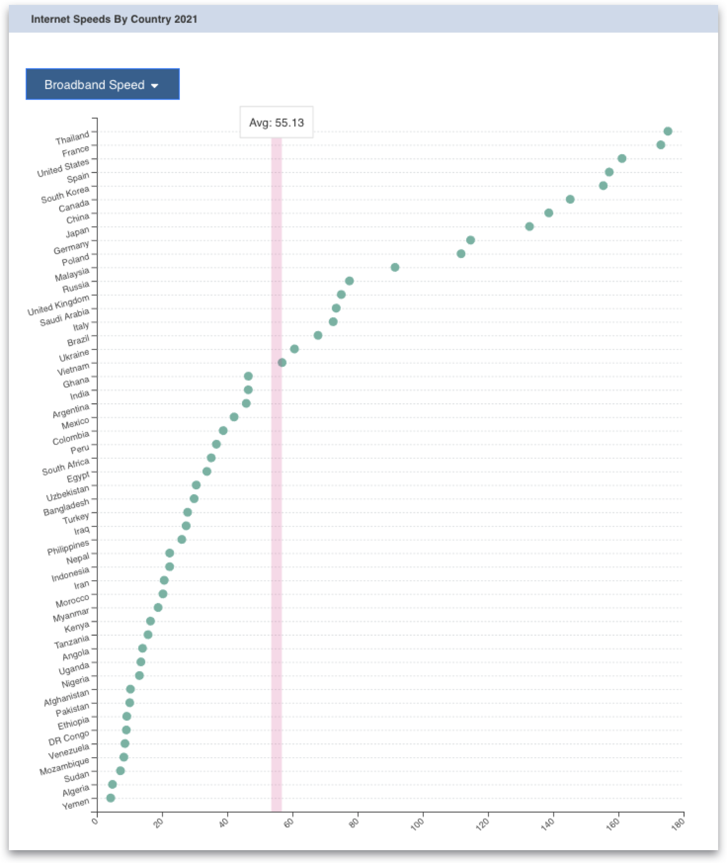
In "Using Modern Image Formats: AVIF And WebP", Addy Osmani, engineering manager at Google Chrome, gives us this fascinating piece of data:
If you’re optimizing for the Web Vitals, you might be interested to hear that images account for ~42% of the Largest Contentful Paint element for websites.
If almost 50% of your LCP is down to images — you need to deliver them to your website visitors in as few bytes as possible. The smaller the image file sizes are on your web pages, the less time it takes for visitors to your websites to download them — and this is especially important on slow internet connections and older, slower devices.
Minimizing the size of your images ensures your Core Web Vitals scores are as good as possible across the board, which means you provide a better experience for your users, and ultimately means your pages rank better in Google search results. And to minimise the size of your images — you need to use the image format that yields the lightest results.
So — if AVIF images currently offer the smallest image file sizes, we should all get on the AVIF train ASAP, right?
Whilst AVIF offers better compression and smaller resulting file sizes than WebP, there are some downsides to adopting this new format in 2021.
AVIF may not be able to compress non-photographic images as well as PNG or lossless WebP. I found this to be the case in my initial experiments with the hero image on the homepage of my personal website.

Whilst this image does contain photographic imagery of my face, most of the image is text and illustrations. As a WebP image, this image came in at 118kb, whilst as an AVIF image, the image size increased to 125kb.
Secondly, at the time of writing this article, not all browsers currently support the AVIF image format. Edge, Safari and some mobile browsers are not quite there yet.
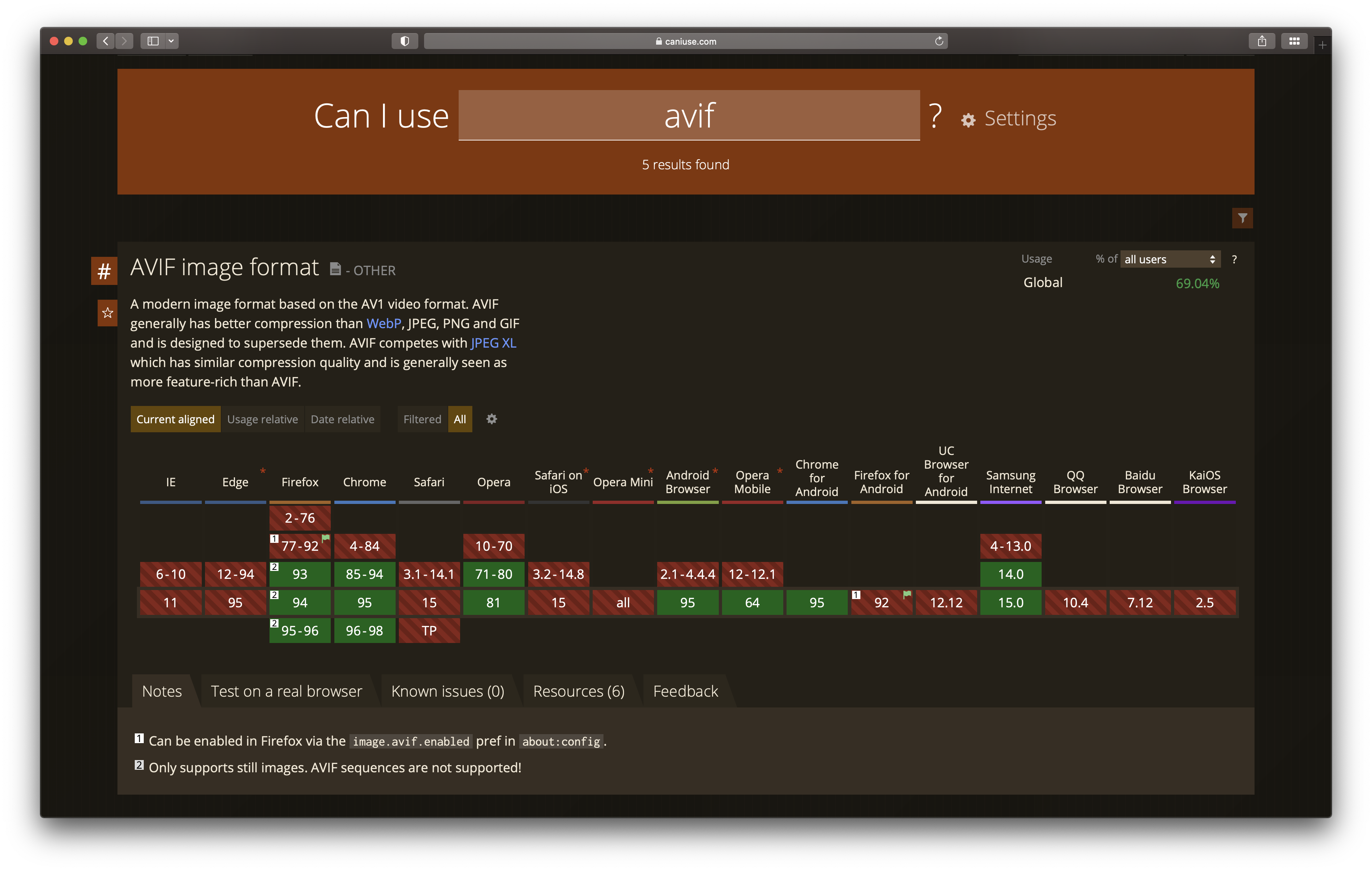
There is a beautiful way we can harness the power of native HTML to serve different supported image formats to browsers using the HTML <picture> tag. And what’s more, when other browsers do catch up with the AVIF train — you won’t need to change any code!
Before we look at the HTML, let’s take a look at how you can convert your images stored in Contentful to the new AVIF format using the REST and GraphQL APIs.
The Contentful Images API offers a variety of image transformations and manipulations as query parameters on the URL pointing to an image asset. You can change the quality of an image, resize it, add a background color, crop it, add rounded corners and more, as well as change the format of an image.
To convert your images stored in Contentful to AVIF, add fm=avif as a query parameter to your image URL. We’ll be using this technique later in the HTML example code.
https://images.ctfassets.net/{space_id}/{asset_id}/{unique_id}/{file_name}?fm=avifHere’s an example URL for you to play with in your browser. Experiment with changing the format parameter to jpg, png, webp, gif or avif and compare the size of the image returned in the network tab!
For the impatient among you, here’s how the image formats compare in terms of size:
jpg: 76.8kb
png: 125kb
webp: 167kb
gif: 1.2MB
avif: 25.3kb
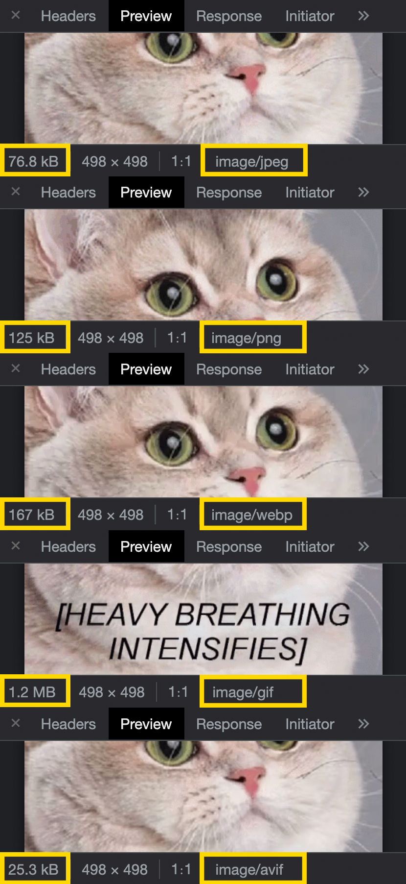
AVIF is the clear winner in terms of reduction in size for this image. However, one interesting thing to note is that whereas the original animated GIF comes in at a whopping 1.2MB, converting the image to WebP reduces the image size by a massive 87% and preserves the animation frames! I think that’s a fascinating achievement and a wonderful nugget of information! I was so excited at this discovery that I shared it on Twitter!
If you’re using GraphQL, you can convert your images to AVIF via a transform function on the image URL in the GraphQL query, like so:
query {
  blogPostCollection(limit: 1) {
    items {
      image {
        url(transform: { format: AVIF })
      }
    }
  }
}
And here’s the response returned. You’ll notice that this is the same image URL we used in the example above, demonstrating that the GraphQL API communicates directly with Contentful’s Images API to return what you need in your GraphQL response.
{
  "data": {
    "blogPostCollection": {
      "items": [
        {
          "image": {
            "url": "https://images.ctfassets.net/zz0ob82dbd6h/5YwujztZwQrte5WfgZf3eV/9eba3414d91e8e1e376fc96c0c8e6d63/cat-heavy-breathing-intensifies.gif?fm=avif"
          }
        }
      ]
    }
  }
}
However — while you can retrieve images in AVIF format in GraphQL — remember that not all browsers support this image format yet — so you don’t want to lock yourself down to the AVIF image format.
Now let’s look at how we can take a base image URL and serve it in different ways to browsers that support different image formats using Contentful’s Images API and the native HTML <picture> tag.
And here is what you’ve all been waiting for!
I’ve attempted to understand the low-down on responsive images from MDN for many years and I must admit it was hard to grasp! This post from Stefan Judis provided a great help in getting to grips with this, in conjunction with MDN.

Before we get into the code, we need to understand what we mean by responsive images. Responsive images are not simply about giving all images width: 100% to fill the size of a container! The real power in responsive images is serving different image files of different sizes to different viewport sizes — and what’s more — screens with different pixel densities or display resolutions. This is called Resolution Switching, and by providing browsers with an array of image URL options by configuring a <source> element’s srcset, media, and type attributes, the most compatible image — according to the current layout and display capabilities — will be displayed.
Let’s get straight into the HTML code example, and unpack what it does.
<picture>
  <source
    type="image/avif"
    srcset="
      https://images.ctfassets.net/.../img.png?q=75&w=500&fm=avif 500w,
      https://images.ctfassets.net/.../img.png?q=75&w=900&fm=avif 900w,
      https://images.ctfassets.net/.../img.png?q=75&w=1300&fm=avif 1300w,
      https://images.ctfassets.net/.../img.png?q=75&w=1700&fm=avif 1700w,
    "
    sizes="(max-width: 735px) 100vw, 736px"
  />
  <source
    type="image/webp"
    srcset="
      https://images.ctfassets.net/.../img.png?q=75&w=500&fm=webp 500w,
      https://images.ctfassets.net/.../img.png?q=75&w=900&fm=webp 900w,
      https://images.ctfassets.net/.../img.png?q=75&w=1300&fm=webp 1300w,
      https://images.ctfassets.net/.../img.png?q=75&w=1700&fm=webp 1700w
    "
    sizes="(max-width: 735px) 100vw, 736px"
  />
  <img
    srcset="
      https://images.ctfassets.net/.../img.png?q=75&w=500 500w,
      https://images.ctfassets.net/.../img.png?q=75&w=900 900w,
      https://images.ctfassets.net/.../img.png?q=75&w=1300 1300w,
      https://images.ctfassets.net/.../img.png?q=75&w=1700 1700w
    "
    sizes="(max-width: 735px) 100vw, 736px"
    src="https://images.ctfassets.net/.../img.png"
    alt="Some great alternative text"
    loading="lazy"
    decoding="async"
    width="2032"
    height="1076"
  />
</picture>The <picture> HTML element wraps <source> elements and one <img> element to offer alternative versions of an image for different displays, devices or browsers (depending on the image formats supported).
The magic in the <picture> element is that the browser chooses the most appropriate <source> element to display. If no matches are found — or the browser doesn't support the <picture> element — the browser falls back to the URL in the src attribute of the <img> element. The selected image is then presented in the space occupied by the <img> element. To prevent Cumulative Layout Shift as the image is loading, it’s important to add the height and width attributes to the <img> element for this fallback.
<picture>
  <source ... />
  <source ... />
  <img
    src="https://images.ctfassets.net/.../img.png"
    alt="Some great alternative text"
    width="2032"
    height="1076"
  />
</picture>The HTML <source> element provides multiple media types for the <picture> element to select the best-fit for the browser or device. You can also use the <source> element inside HTML <audio> or <video> elements in the same way.
In this example, the <source> elements are offering image formats in type="image/avif" and type="image/webp", which browsers will choose to display in that order depending on support.
<source type="image/avif"
  ...
/>
<source type="image/webp"
  ...
/>The HTML srcset attribute is a comma-separated list of strings of image URLs and either a width descriptor — such as 300w, or a pixel density descriptor — such as 1.5x.
srcset="
      https://images.ctfassets.net/.../img.png?q=75&w=500&fm=avif 500w,
      https://images.ctfassets.net/.../img.png?q=75&w=900&fm=avif 900w,
      https://images.ctfassets.net/.../img.png?q=75&w=1300&fm=avif 1300w,
      https://images.ctfassets.net/.../img.png?q=75&w=1700&fm=avif 1700w
    "
The HTML sizes attribute is a comma-separated list of media conditions paired with sizes to describe the final rendered image width — in CSS pixels, not physical pixels (read more about different types of pixels on MDN). The browser wants to know the best-fit resources to request as the page is loading. The sizes attribute helps the browser to calculate the layout of the page and request the most suitable images for the layout — even before the CSS has loaded.
sizes="(max-width: 735px) 100vw, 736px"The srcset and sizes attributes work together in the browser to determine which image defined in the srcset to request as the page is being rendered or the viewport resized.
In this code example, four image URLs are provided in the srcset for four different image widths: 500w, 900w, 1300w, 1700w. Notice that the w={width} parameter on the image URLs is resizing the base image to match with size of the width descriptor using the capabilities of the Contentful Images API. When not using the Contentful Images API, you may wish to choose completely different image URLs at different viewport widths to serve different image sizes.
For blog posts on my personal website, the maximum width of the image container will only ever be 736px — in CSS pixels.
The sizes attribute states that under a viewport width of 736px, choose the most appropriate image from the srcset, considering that the image will be laid out across the entire viewport width (100vw). Depending on the device, full viewport width (100vw) could translate to 300 device pixels at 1 DPR, 600 device pixels at 2 DPR and 900 device pixels at 3DPR.
At a viewport width of 736px and above (remember, it’s 736 CSS pixels), the browser knows that the image widths will not exceed 736 CSS pixels as the CSS is controlling the container width. Depending on the device, 736 CSS pixels will be 1472px at 2DPR and 2208px at 3DPR. At all viewport widths, the browser will choose the closest match from the srcset list. Like magic!
This is an entirely personal example, and you should configure your image widths according to the layout of your web pages. You can also make further optimizations using CSS calc() to account for the padding values inside the container to load even smaller images at different viewport widths.
It’s also important to note that the srcset and sizes attributes only come into effect when the <source> element is a direct child of a <picture> element.
<source
    type="image/avif"
    srcset="
      https://images.ctfassets.net/.../img.png?q=75&w=500&fm=avif 500w,
      https://images.ctfassets.net/.../img.png?q=75&w=900&fm=avif 900w,
      https://images.ctfassets.net/.../img.png?q=75&w=1300&fm=avif 1300w,
      https://images.ctfassets.net/.../img.png?q=75&w=1700&fm=avif 1700w
    "
    sizes="(max-width: 735px) 100vw, 736px"
/>Lazy loading is a strategy to identify resources such as images, video and other media as non-blocking, or non-critical — and to load these only when needed, such as when a user scrolls that resource into view.
To prevent visitors to web pages downloading a full page of images that aren’t visible in the viewport yet, we can use native HTML lazy loading with the loading="lazy" attribute to defer image loading until a user scrolls near it — no JavaScript required! As stated before, to prevent Cumulative Layout Shift, be sure to add the height and width of the base image as attributes to the <img> element, which will instruct the browser to leave the correct space on the page in which to finally load your image when it scrolls into view.
And in addition, the decoding="async" attribute tells the browser that the image loading can be performed asynchronously, so that content below the resource — such as paragraphs of text — are not blocked by the image taking a moment to load.
<img
  ...
  loading="lazy"
  decoding="async"
  width="2032"
  height="1076"
/>
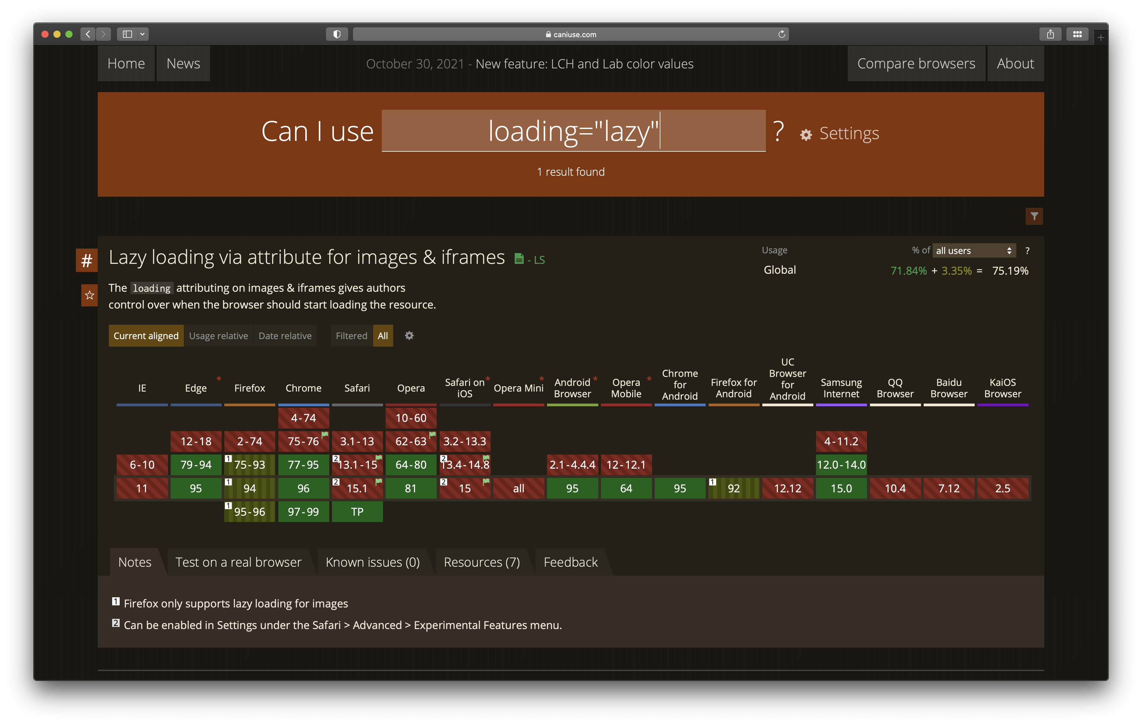
It’s worth a mention that loading="lazy" isn’t entirely supported across all browsers yet, but at the time of writing this article, Safari just shipped it in the newest Tech Preview.
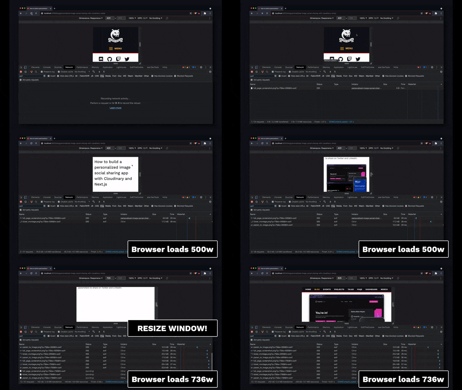
Here’s a video of the code example in action at 1 DPR. Notice the lazy-loading in action as the page is scrolled, and how the browser loads different image URLs from the srcset when the browser is resized! And let me reiterate — no JavaScript required!
The code example above is a lot of HTML to write! But I like it for how self-documenting it is. And what’s more, I’ve bagged some significant performance improvements for my personal website while learning all about AVIF.
For image-heavy blog posts, and in particular this blog post, converting all images from WebP to AVIF reduced the cumulative size of images on a desktop screen at 2 DPR from just over 1Mb to just 404kb. And on mobile devices at 1 DPR, it reduced the cumulative sizes of images from 430kb to 124kb. That’s a 60-70% reduction across device sizes! Those are some huge savings! And plus, all images are lazy-loaded, which means the browser doesn’t request them until the image is near to the visible viewport.
Responsive images on the web are a tricky business to get right! But if you get them right, you provide a better user experience for your website visitors across browsers, devices and screen sizes, and you get bonus points from Google in your Core Web Vitals scores.
If you’d like to see the final code example as a React component in the code for my personal blog site, check it out on GitHub, and if you have any questions about responsive images and how you can make the best of the Contentful Images API, find me on Twitter!